
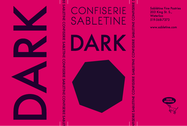
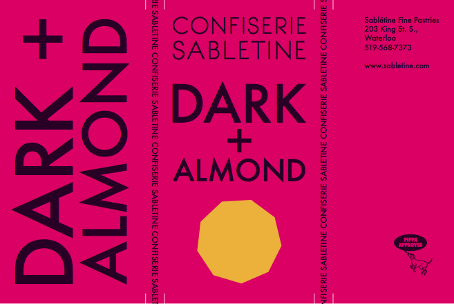
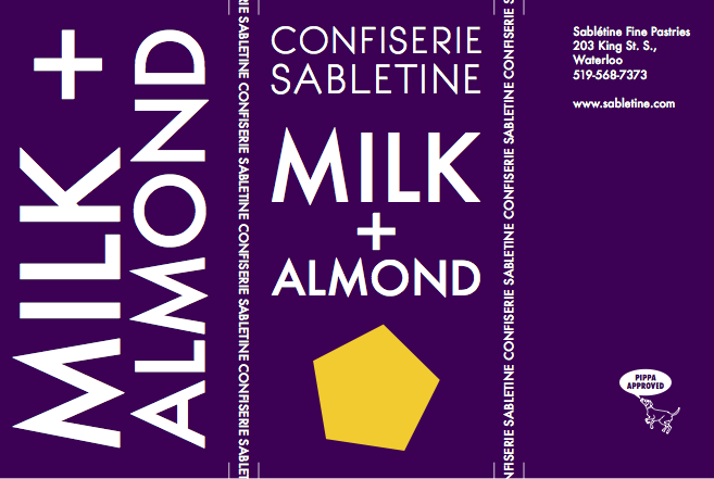
Confiserie
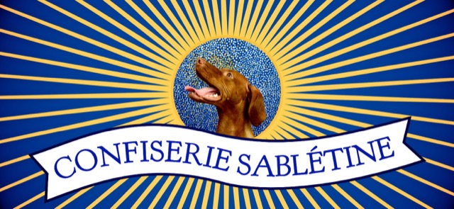
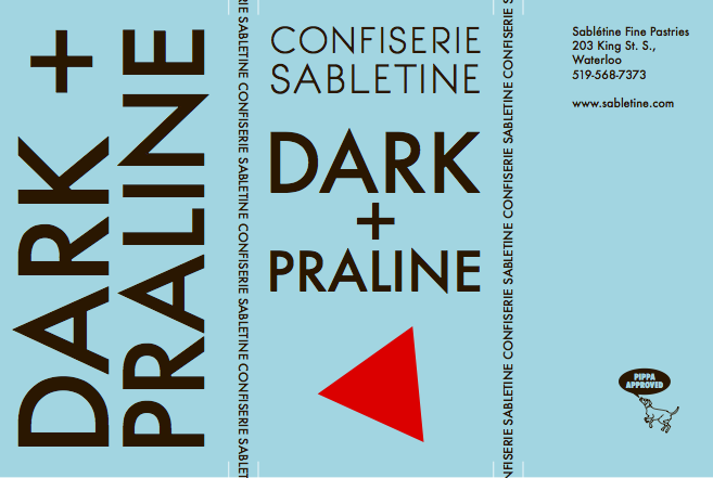
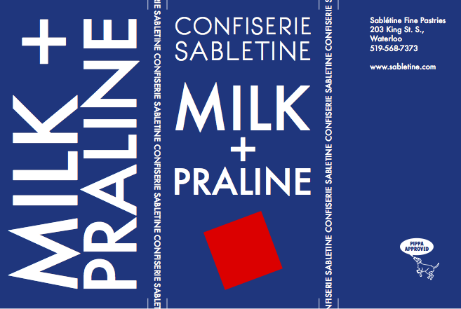
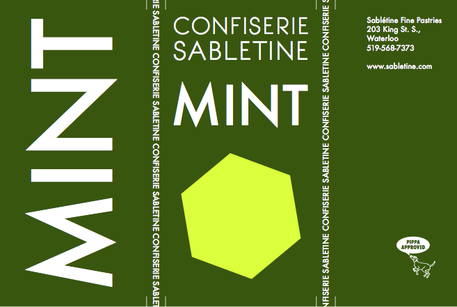
A new logo and packaging were designed for Sabletine’s new line of chocolates and candies under the name Confiserie Sabletine (http://sabletine.com/confiserie.html). A primary focus was a set of 6 chocolate bar wrappers, which you can see below:
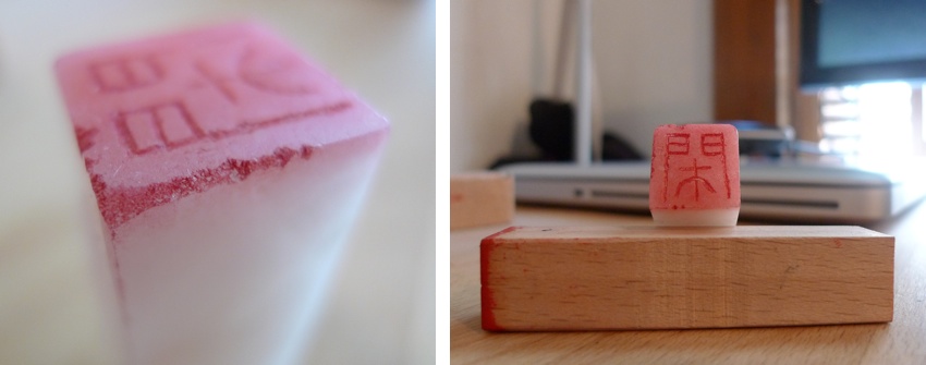
tenkoku
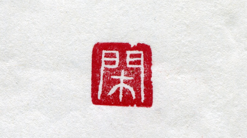
Tenkoku is the Japanese term for the stone seal you sign your name with! Recently I got the chance to carve my own with the help of Noriko Maeda, a master calligrapher who splits her time between Tokyo and Waterloo, Ontario, Canada. The process starts by selecting a symbol that represents you (in my case a tree within a gate that means calm/quiet/peaceful), the transfer of that to the stone being used (in reverse of course), and then carefully scraping away the lines. The stone itself is quite soft and carves easily with metal tools and after several test stamps and minor alterations as suggested by Maeda-san ('take one hair here, not two'), a final rough edge is chipped into the stone to give your seal extra character. As I'm a beginner I was only allowed to do one character, but more advanced carvers achieve extremely intricate and delicate work.
Sabletine Website
Redesigning Sabletine's website started with a simplified layout, twitter integration, and an update to HTML5 and CSS3. All the photography on the website was also redone with a blend of food closeup and action shots of the employees. Overall the aim was for a refined, upscale look.